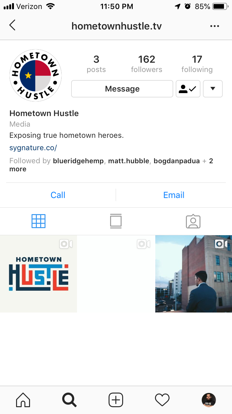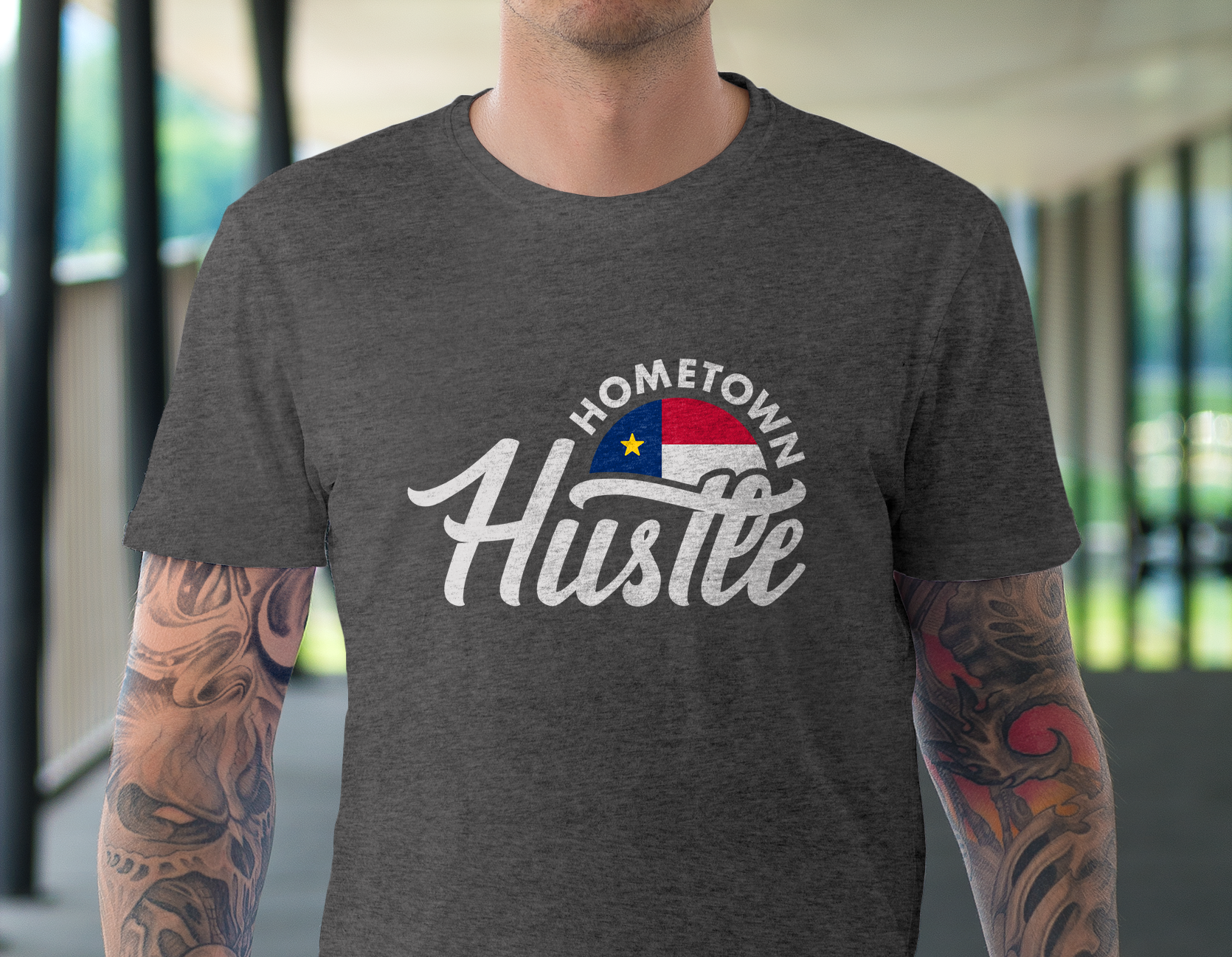
The hosts of the Hometown Hustle video series came to me wanting a set of brand assets that better spoke to the grit, hard work, and sophistication of the guests they interviewed. They foresaw these assets becoming a living brand carrying congruency from their eventual website to elements within the videos themselves to the physical products they'd sell or gift as the project gained traction.
Mood Board
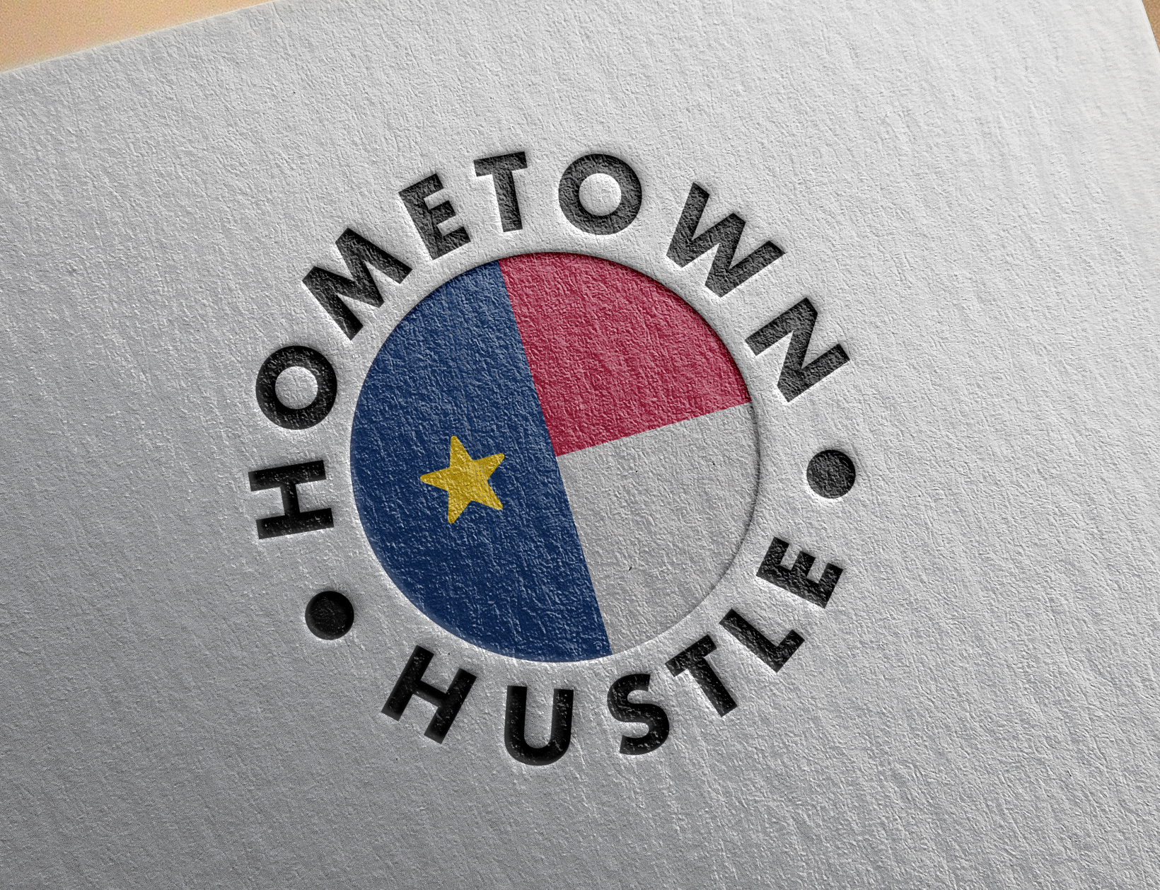
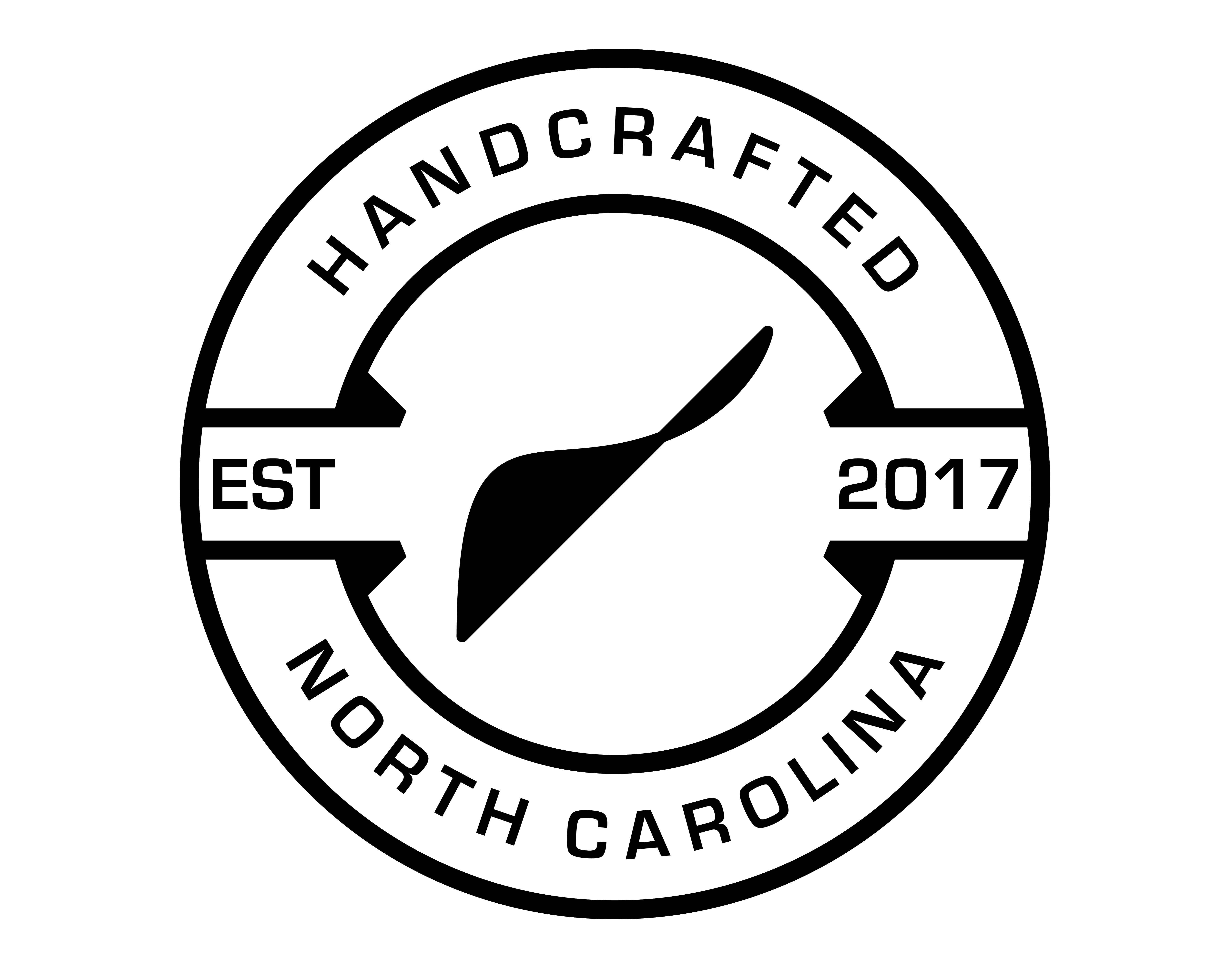
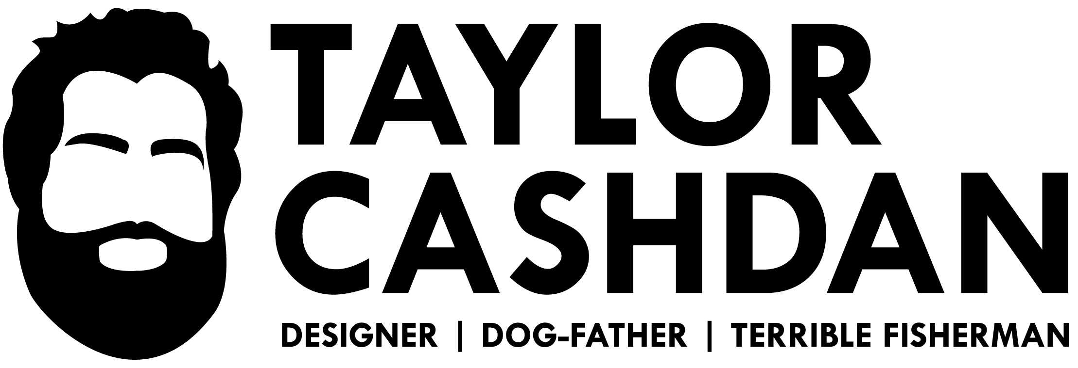
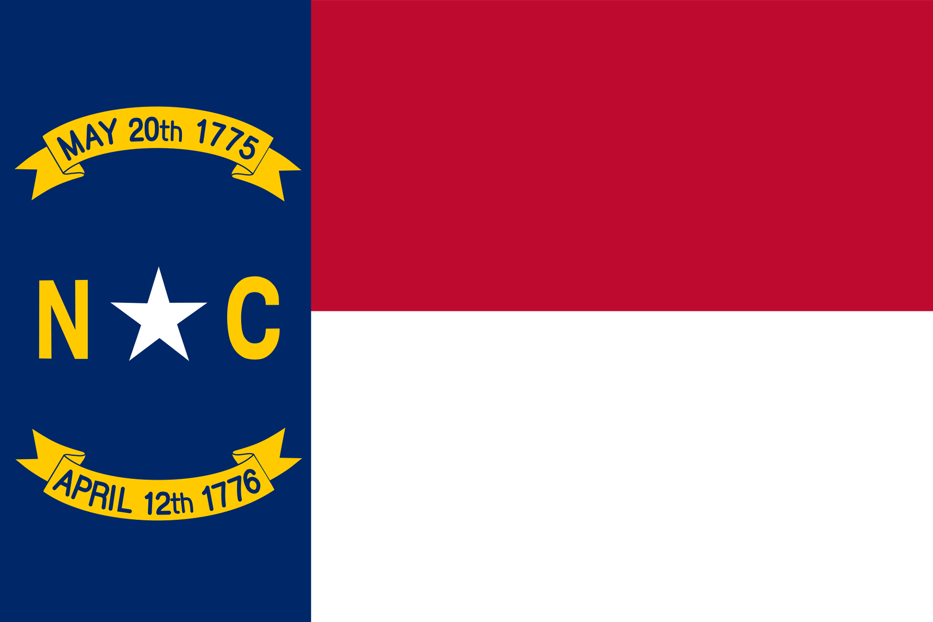
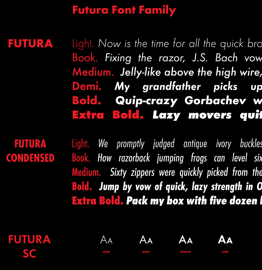
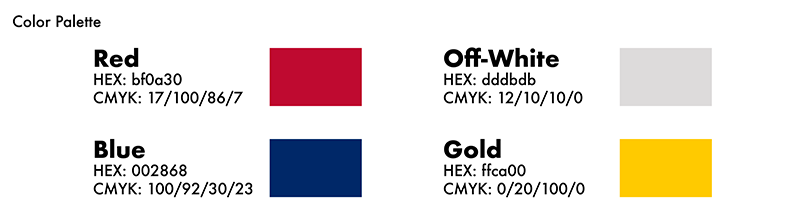
We wanted something that payed homage to North Carolina, incorporated hand-lettered elements, but also was modern enough to boldly stick out when the assets were put into practice. Pulling elements from the NC flag, incorporating street-esque lettering, and pairing them both with the Future typeface met all of those goals.
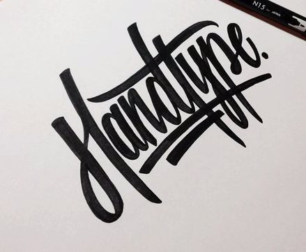
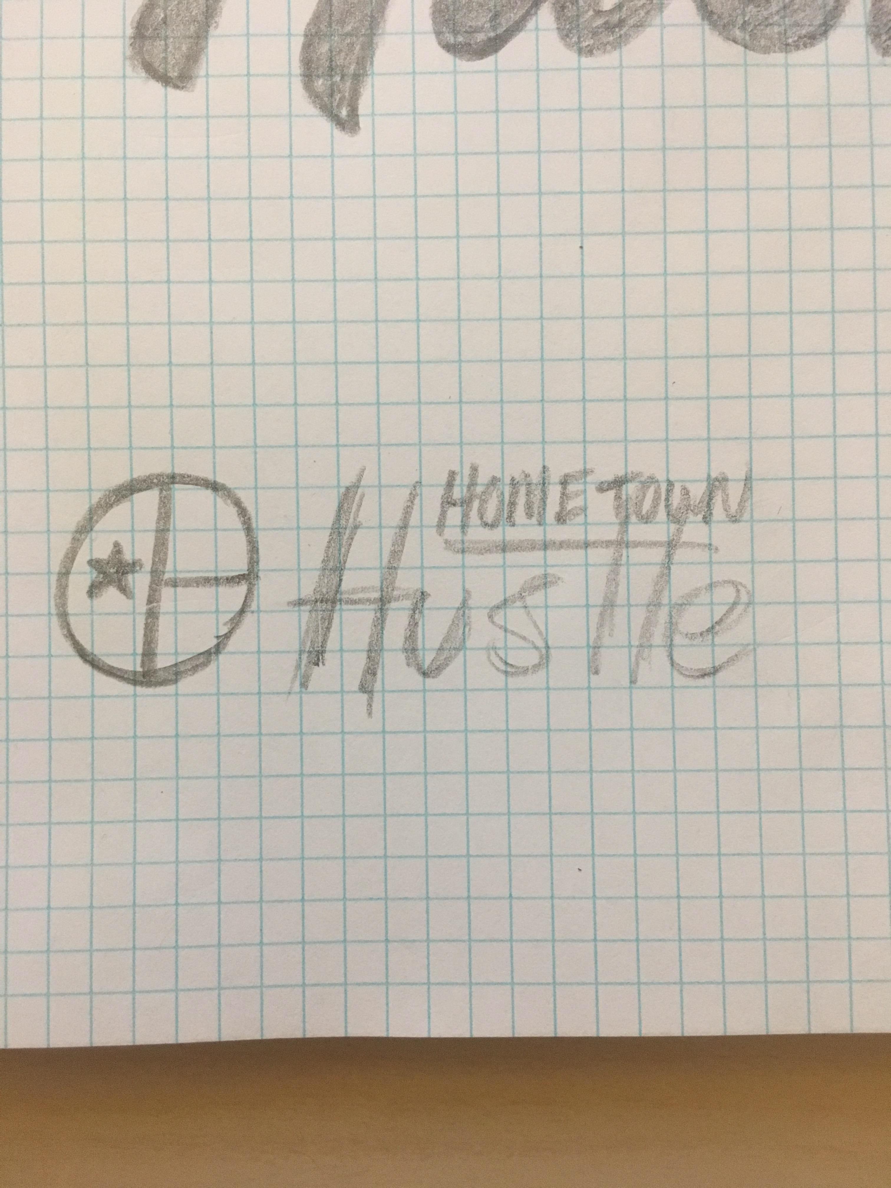
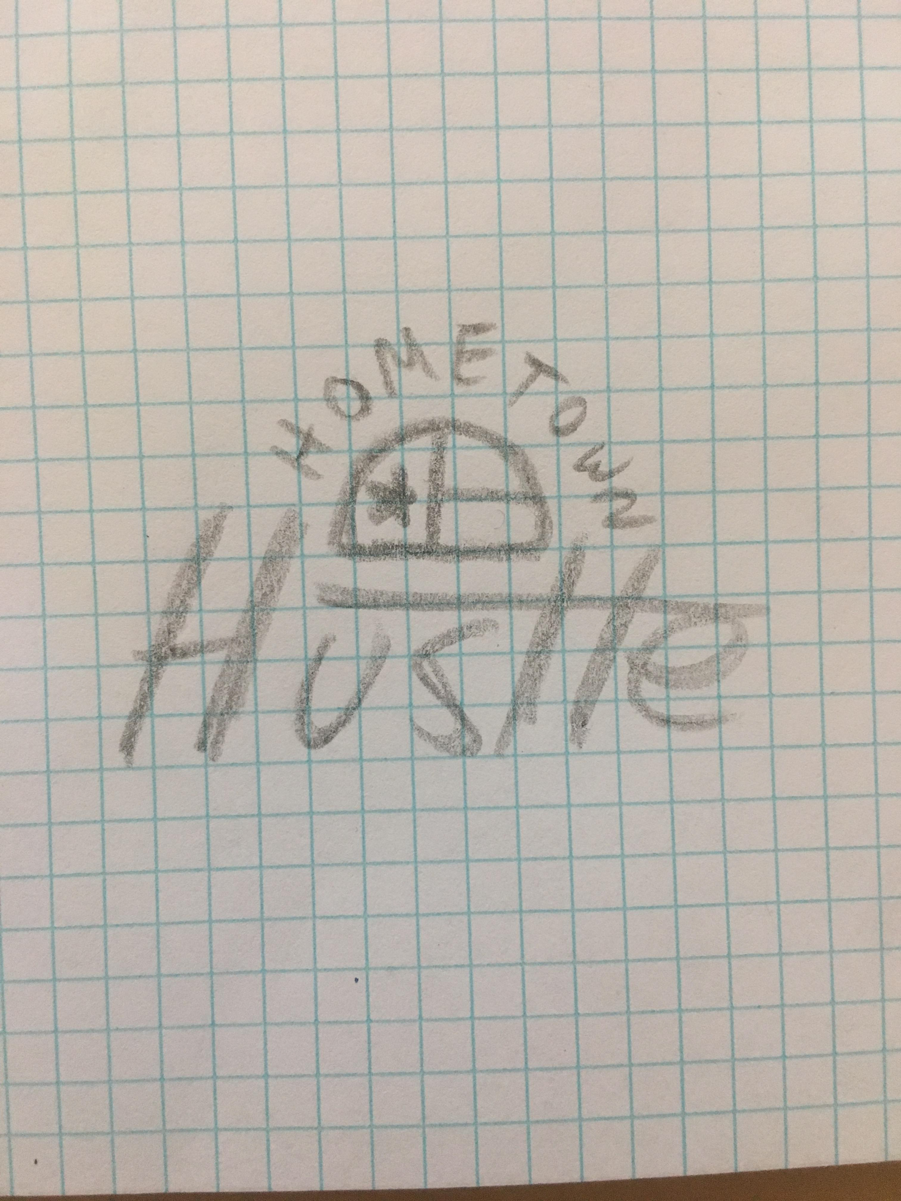
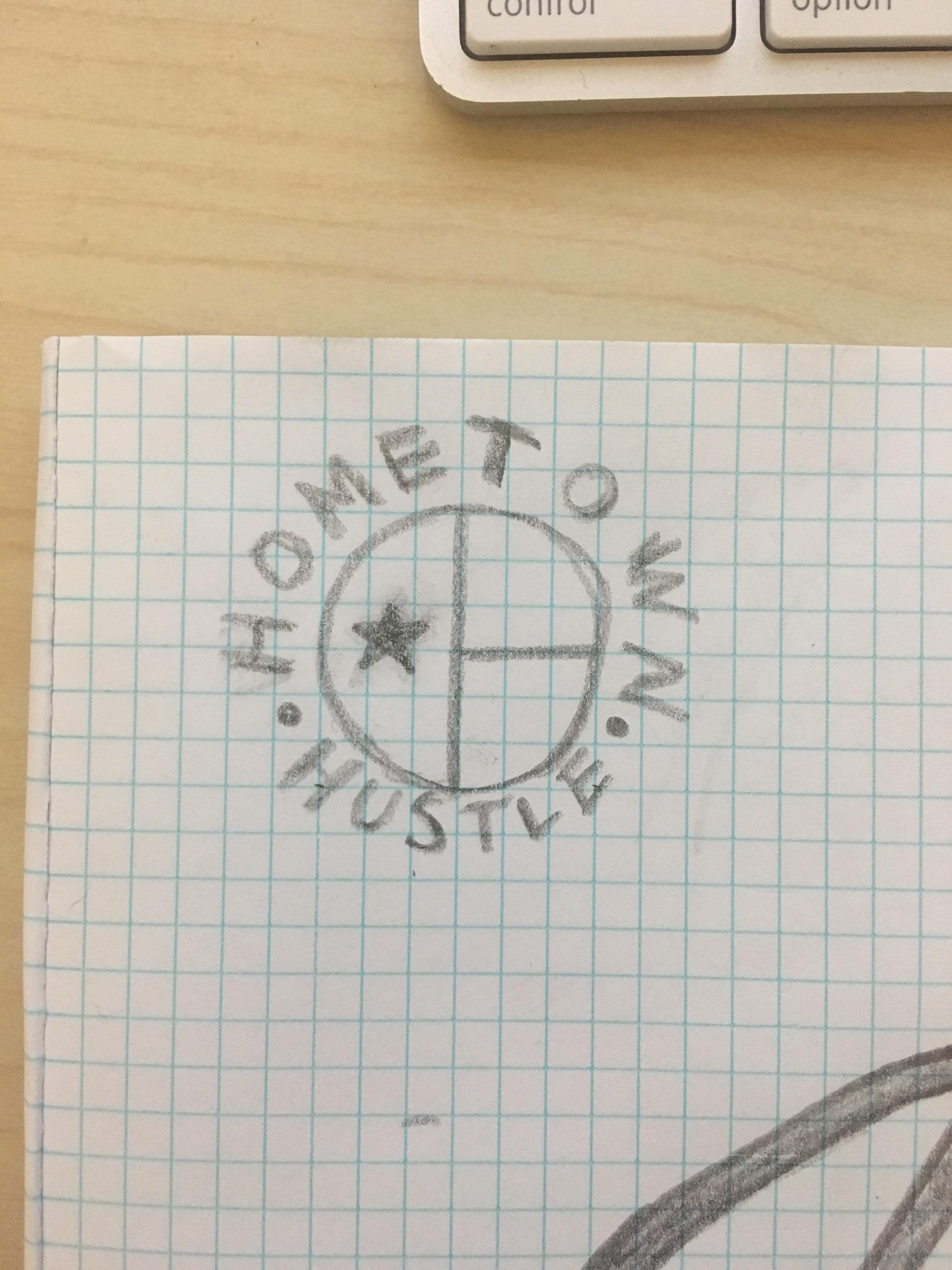
Sketching
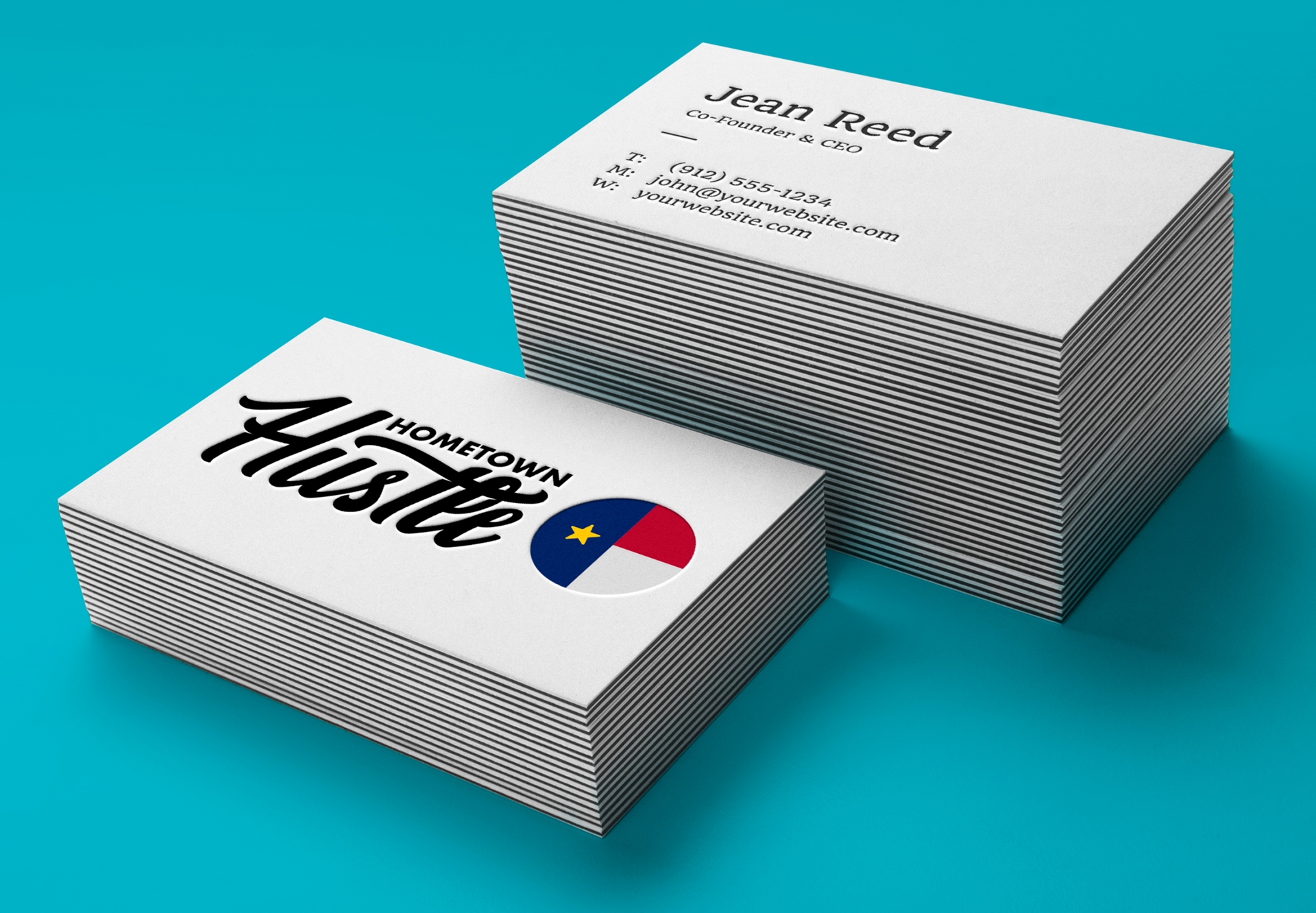
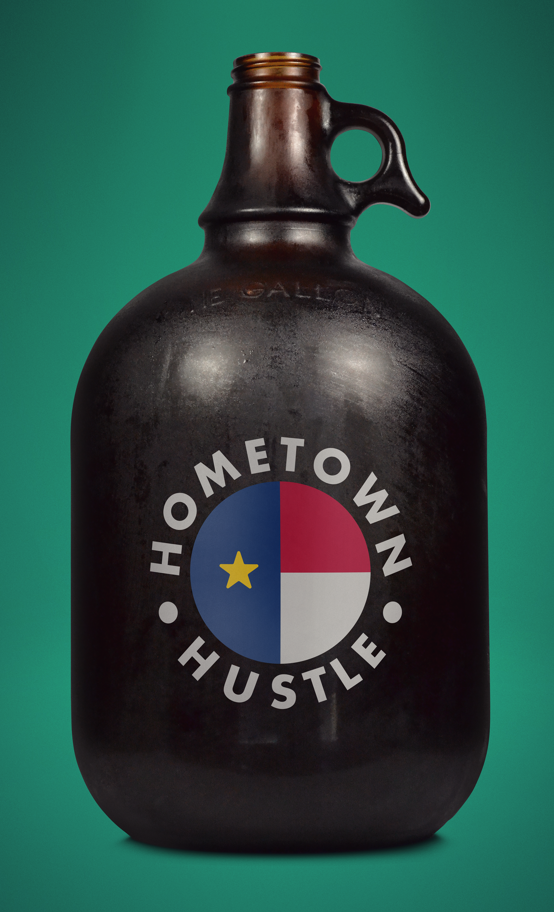
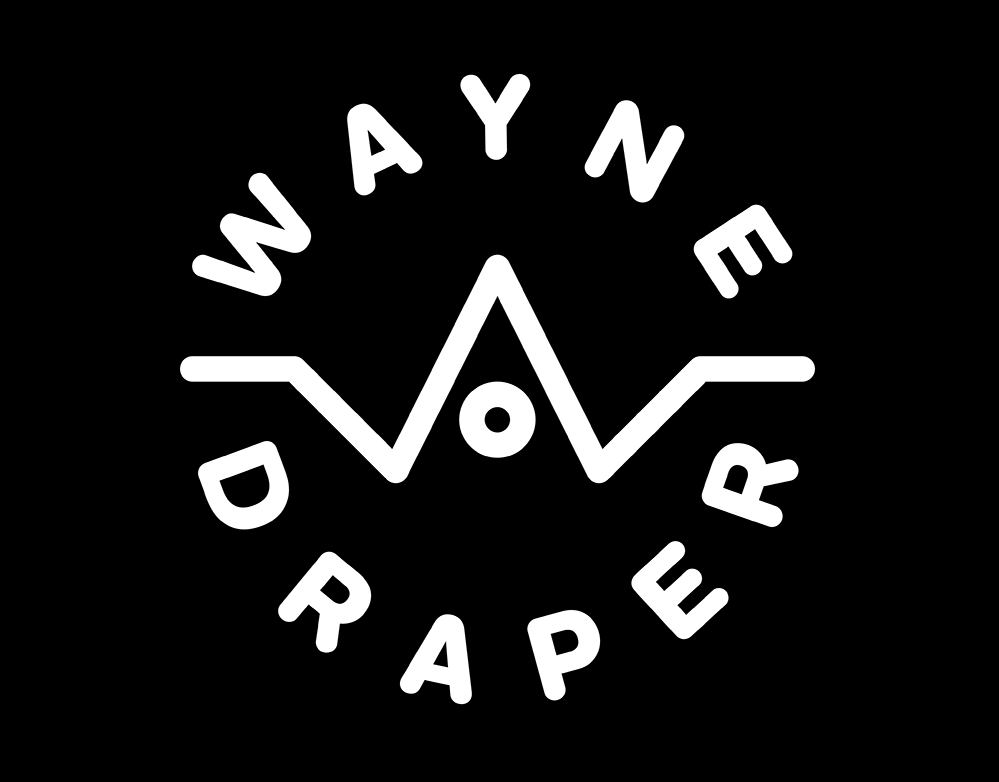
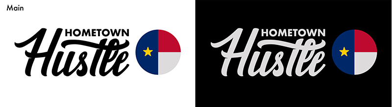
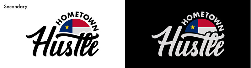
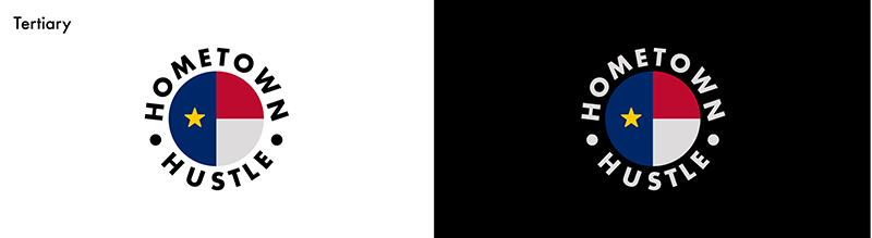
We wanted to be sure that no matter the placement, the Hometown Hustle brand could stay consistent and true to each of its elements. The decided path was to have a main, secondary, and tertiary logo so that the system could work for any medium.
Outcome
Staying true to the goal, a brand was created that spoke to all of the core elements of the Hometown Hustle video series.
Brand in the Wild